Ahern Painting Contractors, Inc.
Branding and Identity
Overview
Ahern Painting Contractors, Inc. needed a refreshed identity that better reflected the quality and professionalism of the business while maintaining the history and credibility of a family-owned company established in 1964.
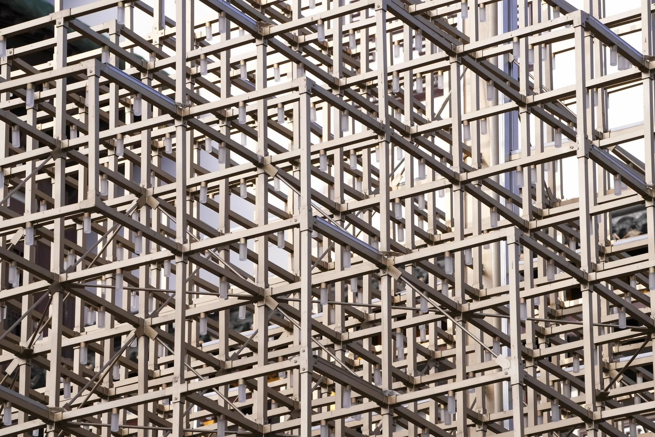
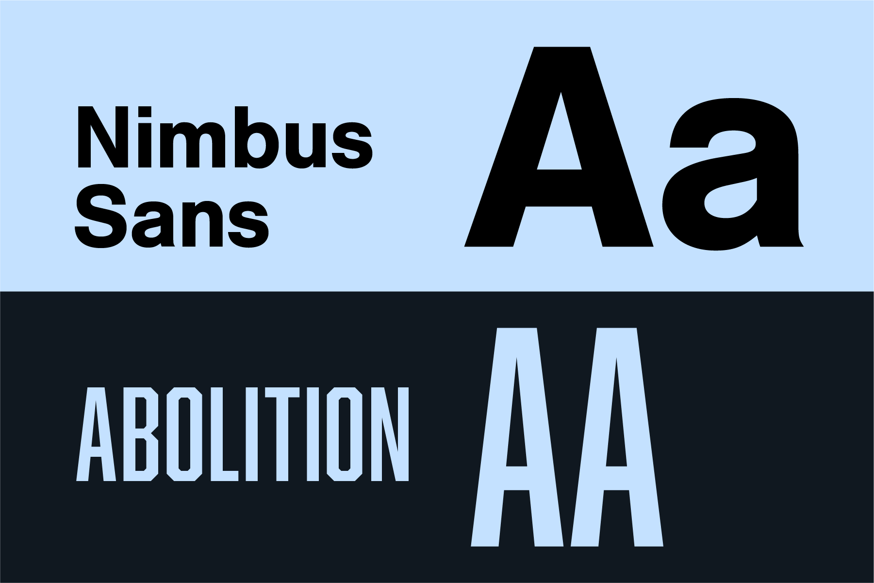
The rebrand replaced an aging, highly detailed identity with a more distinctive and flexible visual system. The new geometric monogram was inspired in part by the structure and repetition of scaffolding—a familiar element within Ahern’s working environment—and became the foundation of the refreshed brand. Paired with a refined color palette and typography, the system felt established, capable, and contemporary while remaining rooted in the company’s industry.
The identity was designed to work across everything from business communications and apparel to equipment and vehicle graphics, giving Ahern a modernized and recognizable presence in the field.
Role
Brand Strategy · Identity Design · Art Direction
Scope
Logo Development · Visual System · Typography · Color · Brand Applications · Print Collateral

Challenge
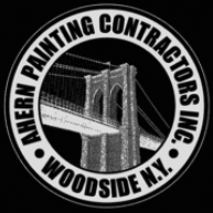
The original identity used a one-color photo of the Brooklyn Bridge at an angle, and the letterforms were so dense that the negative spaces almost disappeared, it looked like a mistake. It would fall apart on a variety of applications. The overall logo was dated and wasn’t reflective of the quality and professionalism of the business. It was also important that the heritage of the family-owned company was considered and came through in a meaningful way.
Inspiration

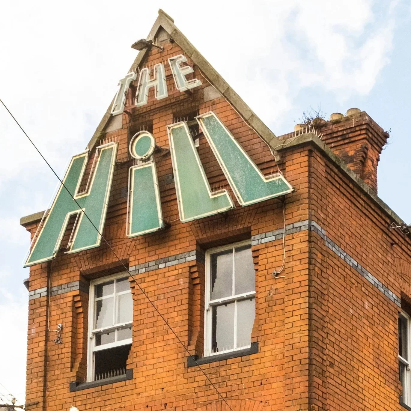

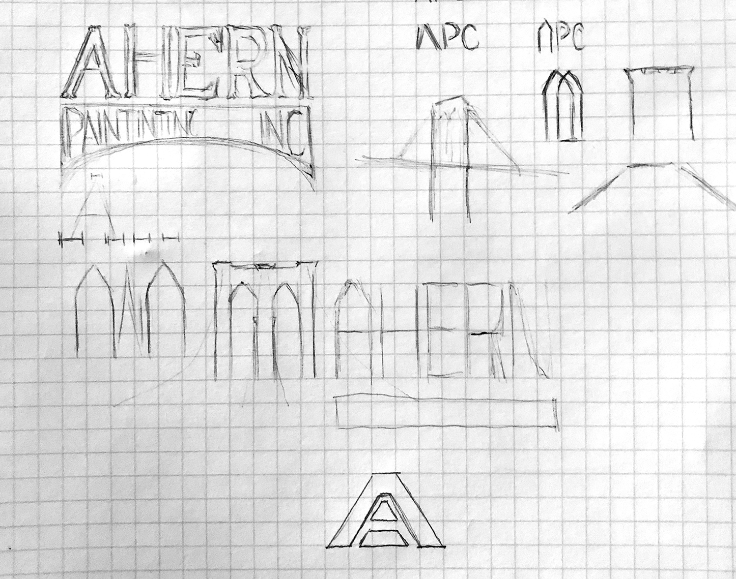
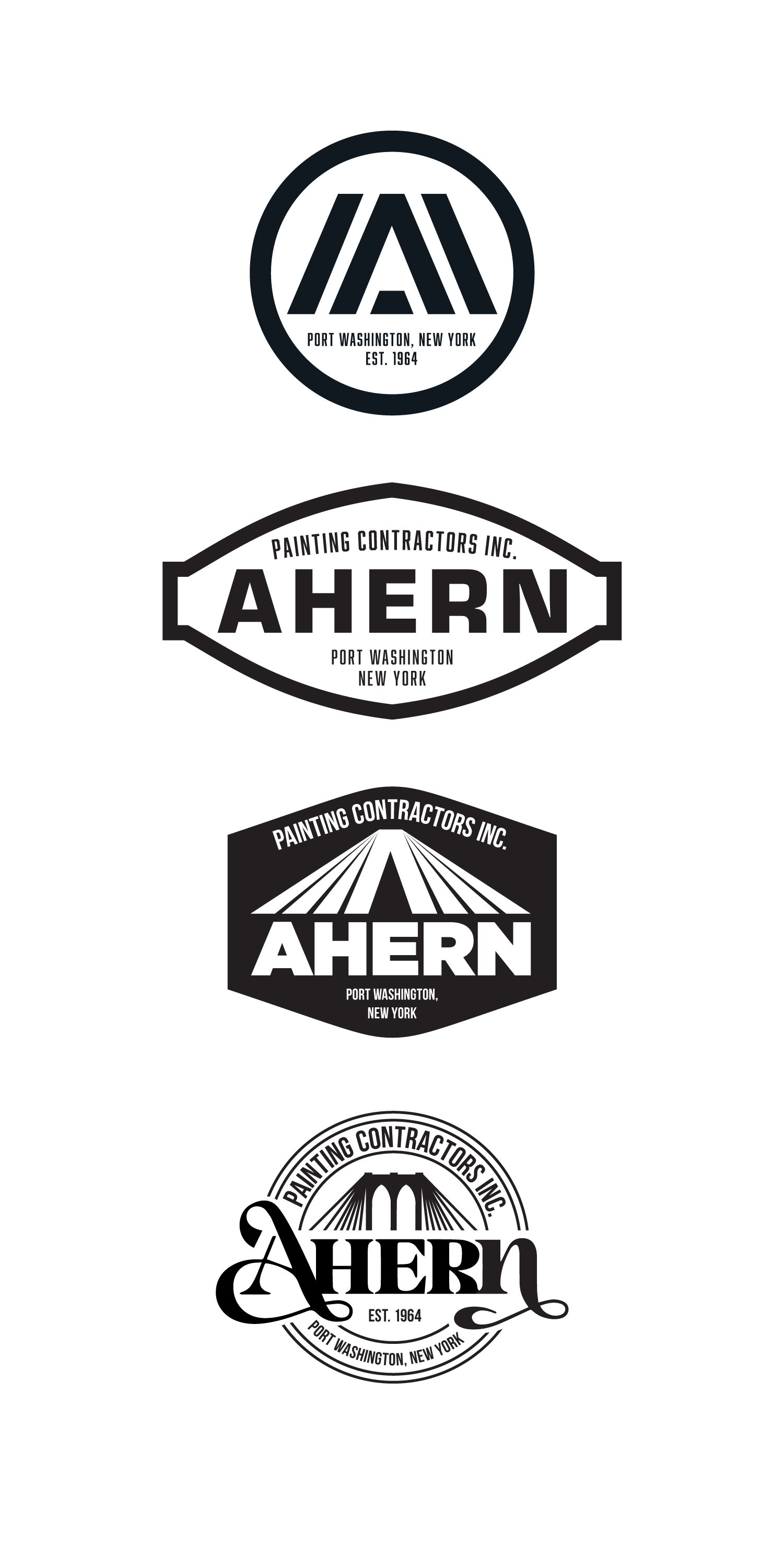
Logo Development: Explorations, Options, Final
Brand Elements
Wordmark
Symbol

Primary Logo
Secondary Logo
Color Palette

Typography
Graphic Assets
Outline + Patterned Symbol

Three-dimensional Symbol

Outlined Symbol

Applications


